
Atlas Reserve
Editorial hospitality. Where silence meets luxury.
Role: Design & Development · Year: 2025
A brand as refined as the property
The client needed a site that felt as considered as the property itself. Standard hospitality templates (centered hero, photo carousel, rate table) fell completely flat against the calibre of the experience on offer.
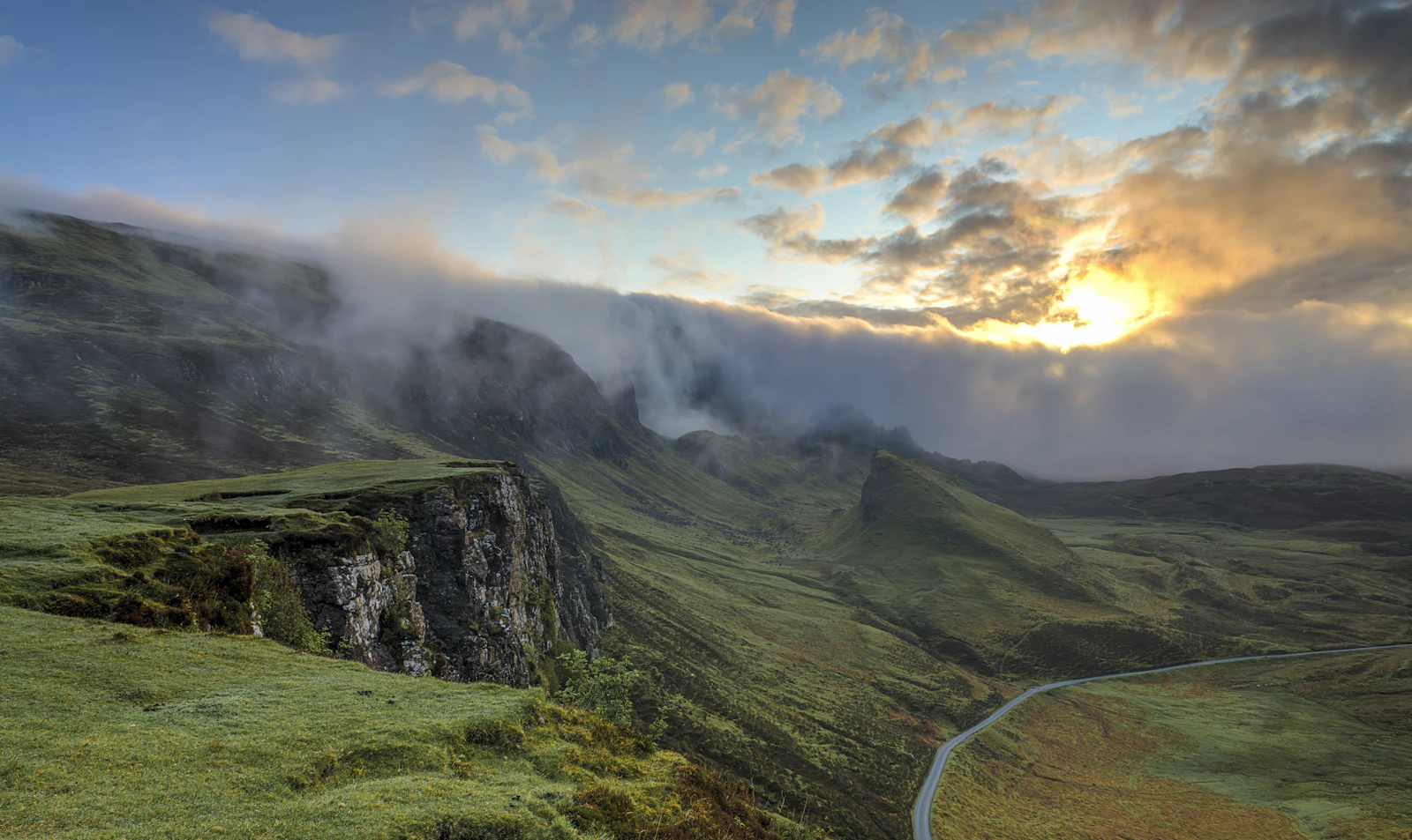
The brief was simple in one sense: make someone want to be there. The execution had to match that ambition in every detail.
Scroll as the journey
Built around ScrollTrigger pinning. Each section is its own cinematic moment. Typography does the heavy lifting between frames. Rather than showing everything at once, the site unfolds like walking through the property itself: one room, one view, one detail at a time.
The palette mirrors the physical space: warm ivories, dark oak, pale morning light. No gradients. Every colour chosen from the property's own materials.
Where the animation lives
Scrubbed parallax on the room photography, staggered copy reveals that feel like pages turning, a booking flow that breathes. Nothing gratuitous. Every tween serves the feeling of unhurried luxury.
See it for yourself
The full experience is built and live. Scroll through the pinned scenes, the room gallery, and the booking flow exactly as a guest would. This is the real thing, not a mockup.